15 Visualization
“A picture speaks a thousand words” is a saying that artists and painters use but which applies to data visualization as well. You will learn to communicate your message using graphs as well as statistics so that you can communicate your message quickly.
15.1 Learning Outcomes
- How to make graphs in R
- The different graph types
- Histogram
- Box plot
- Scatterplot
- Boxplot (Univariate)
- Barplot (Bivariate)
- How to interpret each graph
- Exam Question Examples
15.2 How to make graphs in R
Let us create a histogram of the claims. The first step is to create a blank canvas that holds the columns that are needed. The library to make this is called (ggplot2)[https://ggplot2.tidyverse.org/].
The aesthetic argument, aes, means that the variable shown will the the claims.
library(ExamPAData)
library(tidyverse)
p <- health_insurance %>% ggplot(aes(charges))
If we look at p, we see that it is nothing but white space with axis for count and income.
p
15.3 Add a plot
We add a histogram
p + geom_histogram()
Different plots are called “geoms” for “geometric objects.” Geometry = Geo (space) + meter (measure), and graphs measure data. For instance, instead of creating a histogram, we can draw a gamma distribution with stat_density.
p + stat_density()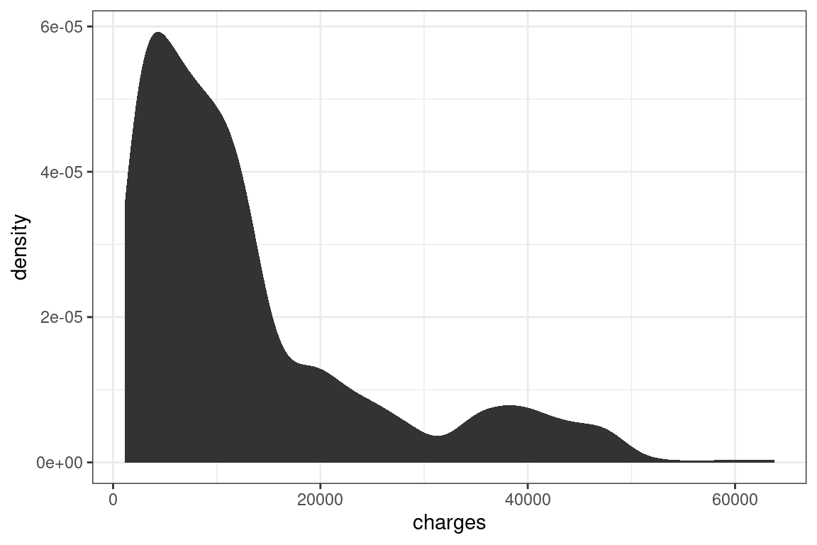
Create an xy plot by adding and x and a y argument to aesthetic.
health_insurance %>%
  ggplot(aes(x = bmi, y = charges)) +
  geom_point()
15.4 Data manipulation chaining
Pipes allow for data manipulations to be chained with visualizations.
health_insurance %>%
  filter(age>10) %>%
  mutate(charges_age_ratio = charges/age) %>%
  ggplot(aes(charges_age_ratio, bmi)) +
  geom_point()+
  theme_bw()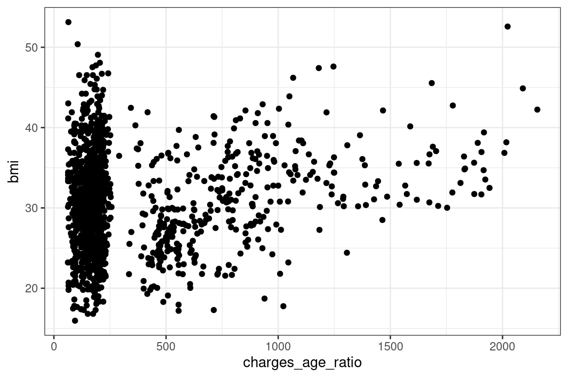
15.5 The different graph types
15.5.1 Histogram
The (histogram)[https://ggplot2.tidyverse.org/reference/geom_histogram.html] is used when you want to look at the probability distribution of a continuous variable.